• If you have bought, sold or gained information from our Classifieds, please donate to Quadraphonic Quad and give back.

    You can become a Supporting Member or just click here to donate.

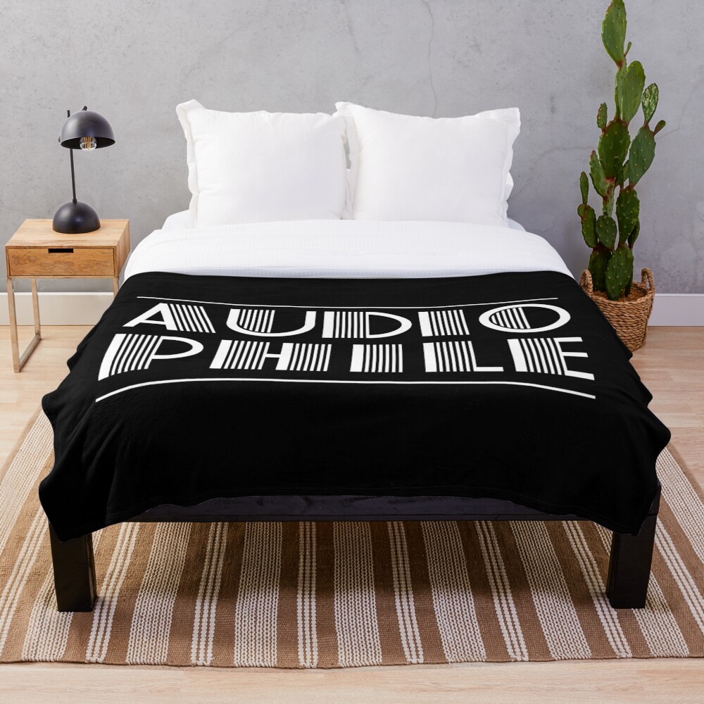
My small collection of retro designs on Shirts, phone covers, posters, etc.

QuadraphonicQuad

Help Support QuadraphonicQuad:

This site may earn a commission from merchant affiliate links, including eBay, Amazon, and others.

kap'n krunch

2K Club - QQ Super Nova
QQ Supporter
Joined
Nov 25, 2008
Messages
9,209
Location
Erased land
I found a few designs online from obsolete film and sound formats and someone told me to set up a small shop online.
Obviously this will not make me rich nor give me a steady income but I thought some of you might like the designs, especially after 4-earredwonder posted one of the logos I already had worked on last night...

¡Saludos!
https://www.redbubble.com/people/empanadilla/shop?asc=u

This one, KAP?

See the source image


OR

See the source image

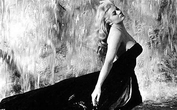
LA DOLCE ANITA
 
Last edited:
I found a few designs online from obsolete film and sound formats and someone told me to set up a small shop online.
Obviously this will not make me rich nor give me a steady income but I thought some of you might like the designs, especially after 4-earredwonder posted one of the logos I already had worked on last night...

¡Saludos!
https://www.redbubble.com/people/empanadilla/shop?asc=u
I love your ideas, and if you come up with a quadraphonic one I'll order the day of release.

One little tip I should mention. The placement of the RCA living stereo (and Panatar as well but not as bad) is an example of it being too low on the shirt and will accentuate anyone's gut line no matter how good or bad shape they are in. It should be across the top (a couple of inches lower than the shirt collar) or shirt (chest area) matching the perfect positioning of where the VistaVisioon logo is placed on that sample. Nice and high up. Makes a guy look more buffed, and a girl look busty in a more sexy way.

I've done shirts and know about this and what looks right. Writing /Text across the chest, and a girl's tits. This is just the way it is!
 
Last edited:
I love your ideas, and if you come up with a quadraphonic one I'll order the day of release.

One little tip I should mention. The placement of the RCA living stereo (and Panatar as well but not as bad) is an example of it being too low on the shirt and will accentuate anyone's gut line no matter how good or bad shape they are in. It should be across the top (a couple inches lower than the shirt collar) or shirt (chest area) matching the perfect positioning of where the VistaVisioon logo is placed on that sample. Nice and high up. Makes a guy look more buffed, and a girl look busty in a more sexy way.

I've done shirts and know about this and what looks right. Writing /Text across the chest, and a girl's tits. This is just the way it is!
See how these are just a tad low positioned (particularly the guy's)?
https://www.redbubble.com/i/t-shirt...y-empanadilla/74239620.IJ6L0.XYZ#&gid=1&pid=1
 
I love your ideas, and if you come up with a quadraphonic one I'll order the day of release.

One little tip I should mention. The placement of the RCA living stereo (and Panatar as well but not as bad) is an example of it being too low on the shirt and will accentuate anyone's gut line no matter how good or bad shape they are in. It should be across the top (a couple of inches lower than the shirt collar) or shirt (chest area) matching the perfect positioning of where the VistaVisioon logo is placed on that sample. Nice and high up. Makes a guy look more buffed, and a girl look busty in a more sexy way.

I've done shirts and know about this and what looks right. Writing /Text across the chest, and a girl's tits. This is just the way it is!
Great advice...will change ASAP...raining cats and dogs and small farm animals in NOLA now (thunderstorms= turning off and unplugging gear)
 
OK, I changed them, let me know!!!
I saw no difference but maybe my browser is not showing a newer page with your update. I'll xcheck again.

Look at this link and scroll down and look at the Panavision and the Wang (green shirt) and tell me if you think they look cool with the higher (perfectly placed) logos?

https://www.redbubble.com/i/t-shirt...y-empanadilla/74239620.IJ6L0.XYZ#&gid=1&pid=1
If you can see them and agree, then good, you'll have hotter looking item(s), and I hope that nobody sends a take-down notice on copyrights. I won't say a word, and you can just keep finding more logos to use.

I personally like the Sea Monkeys and Mr. Bubble t-shirts I've seen. I'm kind of odd, but smart anyway.
 
Last edited:
the setup ;page makes it look higher..will change them now...
They should be higher. I'm confused.

The pink Cinemascope logo looks just slightly too low, whereas the Panavision on black shirt looks perfect. See what I am talking about?
 
OK, took it as high as possible!!!
Ok now yer talking. It looks bolder - "broadcast banner" now. Proudly announcing whatever. LOL! Gotta nail the placement, and if the printer screws up then reject the items.

I've worked on film sets and seen a lot of Panavision and Technicolor type shirts and hats.
 
Would you be interested in doing t-shirts or bumperstickers using logos from vintage radio stations? Like, 93 KHJ or KQIV in Lake Oswego?
 
Last edited:
Back
Top