Favorite Album Art part ii - Albums with multiple variations of the cover artwork

QuadraphonicQuad

Help Support QuadraphonicQuad:

This site may earn a commission from merchant affiliate links, including eBay, Amazon, and others.
The cover to this one varied depending on what format you bought:

CD:
R-389990-1459163159-2230.jpeg.jpg


LP:
R-3522074-1333760090.jpeg.jpg


Cassette:
R-11109008-1509999571-2554.jpeg.jpg
 
Can anyone explain these two covers? The one on top is what I bought back in '75 (covered in dark shrink wrap). Somewhere along the line, the bottom one started to appear on CD's, posters, etc. and seems to be the more common of the two. It looks to me like this was shot on two different occasions. Even the Thorgerson/Powell book For the Love of Vinyl-The Album Art of Hipgnosis doesn't mention different versions of this cover. I was always an album cover junkie and this one has bugged me for years. For what it's worth, I much prefer the top one.

Locations for both covers: the Warner Bros. studio lot in Burbank.
Are they standing at the same spot or have the photograher moved closer?
Outtakes from your favorite version / angle:
PF Wish YWH outtakes.jpg

There are many variations of the Some Girls cover...
Keith explains why the Rolling Stones named their 1978 album Some Girls. (Tougher than Sex Pistols 🤡)
 
toilet-in-a-movie.jpg
"We really have tried to keep the album within the bounds of good taste," said Jagger in 1968, as the controversy stretched on. "I mean, we haven’t shown the whole lavatory. That would have been rude. We’ve only shown the top half. Two people at the record company have told us that the sleeve is terribly offensive. ... We’ll get this album distributed somehow, even if I have to go down the end of Greek Street and Carlisle Street at two o’clock on Saturday morning and sell them myself."

rolling-stones-1968 and.jpg
 
Can anyone explain these two covers? The one on top is what I bought back in '75 (covered in dark shrink wrap). Somewhere along the line, the bottom one started to appear on CD's, posters, etc. and seems to be the more common of the two. It looks to me like this was shot on two different occasions. Even the Thorgerson/Powell book For the Love of Vinyl-The Album Art of Hipgnosis doesn't mention different versions of this cover. I was always an album cover junkie and this one has bugged me for years. For what it's worth, I much prefer the top one.

I can't explain why it was done, but (assuming my memory isn't flipping them) the standing-up-straight-with-more-flames was the U.S. Columbia cover while the other one was on the U.K. Harvest version. I assume the other one has become universal as the catalog was standardized to the original British releases.

It freaked me out 40+ years ago when I realized they weren't the same, though! And the only reason I saw the British cover was because I got the Harvest quad version.

Pink Floyd's part-this-and-that song titles have also been listed in different ways in different territories even when the albums were new. I finally had to create a cheat sheet text file so that whenever I add another version of the song to my server I enter it exactly the same way. I've got three different original 1977 vinyl copies of "Animals" in front of me right now and the opening song is either "Pigs on the wing (Part One)" or just "Pigs on the wing 1" depending on which you're looking at even though the artwork is otherwise identical (at least as far as I can tell).
 
That first Camel album would have violated US federal law because advertising cigarettes was illegal.
 
I can think of a few reasons why there were multiple covers:

- They lost the contract with the original artist

- The original artist died and the art was tied up in probate

- They used a different cover for each separate pressing to keep an idea of how many from each run were still being sold

- Releases made in different countries or through different labels

- Collectability (collect all 24)

- Counterfeit copies

- An anticounterfeiting measure (why they keep changing the money)

- The pressing plant could not get the old ink

- Artist fiat

I have a LOT of CDs which have different covers than the LPs have because the print would be illegible (I found used CD copies of LPs I have so I can play them in the car).
 
Read your post immediately after lighting a Kamel Red. Yes, I spelled that right! Liked them better when they were using Turkish.
A long time ago I ran a smoke shop. Had to know all the codes on the end of the cartons of cigaretts in order to rotate and keep them fresh. From what I remember Brown and Williamson"s code was Blackorwhite. Pall Mall was ambidextrous and Lorrilard was qualitysmoke. Each code had 12 different letters, one for each month.
 
While promoting The Man Who Sold the World in the US, Bowie wore the Mr Fish dress in February 1971 on his first promotional tour and during interviews, despite the fact that the Americans had no knowledge of the as yet unreleased UK cover.[17] The 1971 German release presented a winged hybrid creature with Bowie's head and a hand for a body, preparing to flick the Earth away. The 1972 worldwide reissue by RCA Records used a black-and-white picture of Ziggy Stardust on the sleeve. This image remained the cover art on reissues until 1990, when the Rykodisc release reinstated the UK "dress" cover. The "dress" cover has appeared on subsequent reissues of the album.[19]

Which one is the US cover of Deep Purple's debut album from 1968.
(What do you mean by "pavement" this is a sidewalk.)
Deep Purple Shades .jpg

From Hard Road-The Mark 1 Studio Recordings 1968-69 (5CD Box Set)
 
Tetragrammaton released Shades with the cover on the upper right.
Yes, because that cover is "really" Shades of Deep Purple. :)

Poor David Bowie. Or was this approved by Ziggy? :unsure:
The more commercial album covers made in 1972. 🤡
Davdi Bowie as Ziggy.jpg

This image remained the cover art on reissues until 1990...
 
And then there's Zeppelin's In Through the Out Door. They got a little obnoxious with theirs. If you were trying to collect them all, they made it more difficult by packaging them in a brown paper bag so you didn't know which one you got until after you bought it!

LedZeppelin-InThroughTheOutDoor_VARIATIONS.jpg
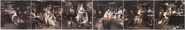
Wasn't this the first one to do this? (Multiple versions, not different countries/labels.) These guys were getting notorious for excess with their album covers and this was a natural progression. Not excess like the fancy Tull covers. More pointedly obnoxious to the record company with stuff like a gatefold sleeve with no mention of the band's name.

Heh yeah, you had to rip the shrink wrap in the corner and pull the bag down 1/4" to see the letter on the spine (A-F) to see which one it was. I collected all these when I was in high school and I got kicked out of a number of record stores going through the stack (carefully) ripping the shrink wrap down in the corner! I think I found the last one at a used store in college. Took 3 or 4 years to find all 6.

And then if you spill the bong on the inner black and white sleeve, it has water colors impregnated into the paper and paints itself florescent colors. I painted one of mine with water and a brush (to stay in the lines), so I suppose that one is devalued now.

I remember noticing that Police album at the time. I was all high school and Black Sabbath and Led Zeppelin and the Police were too MTV pop for me at the time though. Never collected any of those. Had no idea there were THAT many! Guess they had to do more than 6 after Zep? And nope, never heard of that Garfunkel one!

So if we don't count reissues, different countries/labels, picture discs, etc, looks like there's just a few?

Hey, was Bowie - Man Who Sold the World different country releases? But maybe it was a similar idea? Just taking advantage of the different country's releases to do it?
 
Back
Top